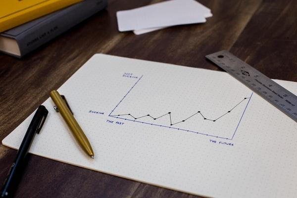
In order for businesses to be successful, they need access to data. This data can come from a variety of sources, including customer interactions, social media, public records, and internal data. By analyzing this data, businesses can identify trends, understand customer needs, and make better decisions. A great way to analyze this data is to visualize it. Data visualization is the presentation of data in a graphical or tabular form. This can help business owners and employees to understand and make decisions based on the data.
There are many ways to visualize data, including bar graphs, area charts, and line charts. Keep reading to learn more about line charts, including the variants of a line chart.
What is a line chart?

A line chart is a type of graph that consists of a series of data points connected by straight lines, which can be used to track the progress of a particular variable over a period of time. Line charts are often used to track the progress of stocks, share prices, or other economic indicators.
What are the types of line charts?

The line chart is one of the most basic charts there is, as it simply shows a series of points connected by lines. The advantage of this type of chart is that it’s easy to see changes over time. There are several variants of the line chart, but all display data in pretty much the same way:
- Step-line charts are used to track changes or trends over time, but they are also used to show the discontinuities or steps in the data.
- Scatter plot charts are used to track the relationship between two sets of data.
- Area charts display the magnitude of change between points on the x-axis and the y-axis. They can be used to compare values over time or to visualize proportions.
- Stacked line charts are similar to area charts, but they do not fill in the space between data points. This makes it easier to see how individual values contribute to the whole.
- Clustered line charts combine multiple series of data into one graph. This can be helpful for comparing different measures at once or for seeing how a single measure changes over time.
- Overlapping line charts display two or more lines overlaid on top of each other. They can be used to compare data sets or show how one data set changes over time in relation to another data set.
What are the best practices when creating a line chart?

There are a few things to keep in mind when creating a line chart. First, the x-axis should represent the time or date while the y-axis should represent the value or data. Make sure the data is linear, as it should be evenly spaced and follow a consistent trend. The line should also be smooth and uninterrupted. If there are any sharp changes in the data, they will be reflected in the line chart.
When creating a line chart, it is important to choose the right type of data. The most common types of data are time-series data and categorical data. Time-series data is collected at regular intervals to track changes or trends over time. Categorical data is divided into categories to compare different groups or track changes over time.
Once you have chosen the type of data, you need to decide what type of line chart to use. As mentioned above, there are many different types of line charts, and each has its own strengths and weaknesses. The type of line chart you should use depends on the data you are trying to visualize and the message you want to send.
A line chart is important because it can help people understand data in a clear and concise way. Overall, it is a useful tool for data visualization and helping businesses make sense of their data.
Leave a Reply